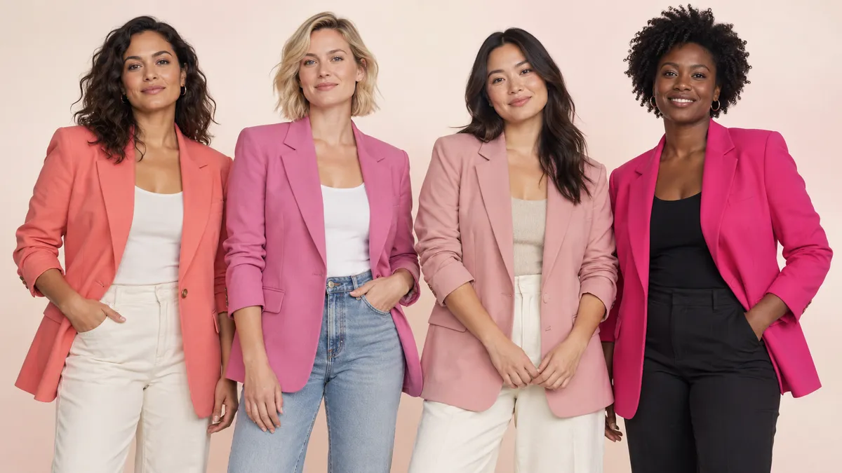
Harmony makes the color feel effortless. Contrast makes it feel intentional. This guide helps you choose either on purpose by looking at undertone, skin depth, contrast, saturation, fabric, and natural light.
First, Separate Skin Tone From Undertone
Skin tone describes the visible depth of your complexion, from very light through medium to deep. It can shift with sun exposure and season.
Undertone is the quieter color direction beneath that surface: warm, cool, neutral, or olive. It tends to stay more consistent. Two people with similar skin depth can wear the same pink very differently because their undertones and natural contrast are not the same.
Then there is contrast: the visual difference among your skin, hair, eyes, and brows. High-contrast coloring can carry very clear or saturated pinks with ease. Lower-contrast coloring often looks especially refined in softened, smoky, or tonal pinks—though reversing that relationship can create a beautiful statement.
Think of these as styling controls, not a verdict.
A 30-Second Way to Explore Your Undertone
Stand near a window in indirect daylight, without a strongly colored wall reflecting onto your face. Hold two jacket colors close to the neckline:
- a warm coral or peachy pink;
- a cool rose, berry, or blue-based pink.
Look at the whole face, not just whether the fabric “matches.” Which color makes the eyes, lips, and skin look clearer? Which creates shadows you enjoy, and which makes the jacket seem to arrive before you do?
- If warm pink feels naturally connected, explore coral, salmon, peach rose, and warm blush.
- If cool pink feels crisp and alive, explore rose, raspberry, fuchsia, icy pink, and blue-based baby pink.
- If both work easily, you may enjoy a neutral direction and can choose by outfit mood.
- If many colors seem to turn unexpectedly orange or gray, try olive-friendly pinks with either earthy depth or strong, clean saturation rather than chalky beige-pinks.
Vein color and jewelry can offer clues, but the jacket test is more useful because it shows the actual scale, fabric, and proximity of the garment you are choosing.
Warm, Cool, Neutral, and Olive: Where to Start
Warm undertones: make the pink feel sunlit
Start with coral, salmon, peach pink, warm rose, and blush with a hint of apricot. These colors echo golden and peach warmth beautifully.
For a soft look, wear a warm blush jacket with an ivory knit, ecru denim, and tan leather. For more impact, choose vivid coral with dark indigo jeans and turquoise or warm gold accents. If you love cool pink, make the contrast deliberate: a clean fuchsia over chocolate brown can look graphic rather than disconnected.
Cool undertones: look for clarity or blue-based depth
Rose pink, raspberry, fuchsia, berry, icy pink, and mauve are useful starting points. A cool pink can sharpen the face and make a simple outfit feel precise.
Try a blue-based rose blazer with charcoal trousers, a fuchsia puffer over a black base, or icy pink denim with navy. If you want warm coral, pair it with a cool anchor—deep navy, optic white, or pewter—to turn the temperature difference into an editorial choice.
Neutral undertones: choose the mood first
Neutral undertones often move comfortably between warm and cool pinks. Your strongest filter may be saturation and personal contrast rather than color temperature.
Dusty rose and balanced medium pink are easy everyday choices. Hot pink adds drama; warm blush feels relaxed; mauve gives a quieter, more intellectual mood. Use the rest of the wardrobe to steer the color: camel makes pink warmer, charcoal makes it cooler, and denim makes it casual.
Olive undertones: avoid the muddy middle
Olive skin can be light, medium, or deep and may read warm, neutral, or cool depending on the surrounding colors. Pink choices often become clearer at the ends of the spectrum: earthy rose and coral on one side, vivid raspberry and fuchsia on the other.
If a beige-pink looks gray against the skin, do not conclude that pink is the problem. Try more saturation, more depth, or a cleaner temperature. A raspberry jacket with cream and dark olive can be especially striking; coral with ecru and chocolate feels warm and grounded.
The Pink Jacket Shade Matrix
| If your coloring leans… | For quiet harmony | For polished contrast | Easy outfit base |
|---|---|---|---|
| Warm | Warm blush, peach rose, dusty coral | Clear fuchsia, cool raspberry | Ivory, olive, chocolate, dark denim |
| Cool | Icy pink, cool rose, mauve | Warm coral, saturated salmon | Charcoal, navy, optic white, pewter |
| Neutral | Balanced rose, dusty pink, soft berry | Hot pink or very pale blush | Camel, gray, denim, cream |
| Olive | Earthy rose, coral, deep warm pink | Raspberry, magenta, blue-based fuchsia | Cream, espresso, dark olive, indigo |
This matrix is a starting wardrobe edit, not a ban list. A “contrast” pink can be the most exciting option when the silhouette is clean and the rest of the outfit supports it.
Skin Depth Changes the Scale of the Color
Light skin: whisper or punctuation
Very pale blush can create an airy, tonal effect; a clear berry or fuchsia becomes graphic punctuation. If a pale pink disappears into the complexion, add separation with a navy collar, white tee, charcoal knit, or stronger lip color.
Medium skin: give pink enough definition
Mid-depth rose, coral, raspberry, and dusty pink often show their complexity beautifully on medium skin. Very pale pink may need a darker neckline or richer lower half so the outfit does not lose definition.
Deep skin: let saturation do the talking
Vivid fuchsia, hot pink, saturated coral, raspberry, and clear baby pink can create spectacular contrast. Dusty rose and mauve can be equally elegant when they have enough depth or are paired with a luminous cream, polished leather, or defined dark neutral.
The goal is not to make every pink behave like a neutral. Sometimes the most beautiful result is the pink that clearly stands apart.
Saturation and Contrast Matter as Much as Undertone
Two cool pinks can feel completely different. Dusty mauve is softened with gray; fuchsia is clear and saturated. Two warm pinks can range from barely-there blush to electric coral.
Use your natural contrast—and your personality—as the dial:
- Soft coloring or a quieter wardrobe: dusty rose, mauve, shell pink, and muted coral create nuanced color without a hard edge.
- High contrast or a graphic wardrobe: hot pink, raspberry, clear coral, and fuchsia hold their own against dark hair, strong brows, black, white, and deep denim.
- Minimalist style: choose a beautifully cut jacket in one disciplined pink and keep the base monochrome.
- Color-loving style: repeat the pink temperature in one small accent, then add a neighboring or contrasting color such as burgundy, red, cobalt, or olive.
Fabric Can Change the Pink More Than the Color Name
Online color names are useful labels, not exact promises of how a jacket will look in your life.
- Satin and high-shine nylon reflect light, making pink appear brighter and more changeable.
- Suede and brushed wool absorb light, making rose and mauve feel deeper and softer.
- Denim adds texture and often makes pale pink feel casual rather than precious.
- Leather increases depth; seams and grain create shadows that give pink more attitude.
- Puffer quilting creates highlights and shadows across the same color, especially in glossy fabrics.
If you are deciding between two shades online, compare product photos in different lighting and look for video. In person, step away from the fitting-room spotlight and check the jacket near daylight.
Four Complete Outfit Directions
Warm harmony
Coral-pink cropped jacket + ivory ribbed knit + dark indigo wide-leg jeans + tan ankle boots + warm gold earrings.
The contrast comes from denim depth, while the colors near the face stay warm and connected.
Cool clarity
Blue-based rose blazer + soft-gray tee + charcoal trousers + oxblood loafers + silver hoops.
Gray sharpens the pink; oxblood adds depth without introducing a competing bright.
Olive with saturation
Raspberry bomber + cream tee + deep olive cargo trousers + espresso sneakers + dark brown bag.
The saturated pink avoids the muddy middle, while olive and espresso make the look grounded.
Deep-skin tonal elegance
Dusty-rose longline jacket + cocoa knit dress + burgundy knee boots + polished gold cuff.
Depth, texture, and sheen keep a muted pink from feeling flat.
How to Test a Pink Jacket Before You Buy
- Wear a neutral top with the neckline you use most often.
- Look at the jacket open and closed; the amount of pink near the face changes.
- Check it in indirect daylight.
- Take one photo without a filter and compare it with what you see in the mirror.
- Hold your most-worn bag or shoe color next to it.
- Ask whether you like the harmony or the contrast—not whether a generic rule says the shade is “correct.”
If the jacket makes you want to build three outfits immediately, that is useful evidence.
Browse by Shade
- Warm versus cool: see the warm pink vs. cool pink guide when available.
- Outfit colors: use What Colors Go With a Pink Jacket? to finish the look.
- Complete looks: visit Pink Jacket Outfits for silhouettes, shoes, and occasions.
- Buying the jacket type: start with How to Choose a Pink Jacket.
The best pink for your skin tone is not a single swatch someone else can assign you. It is the pink whose temperature, depth, and energy create the effect you want—and whose jacket shape makes you reach for it again.
Frequently Asked Questions
Which shade of pink suits warm undertones?
Coral, peach pink, salmon, warm rose, and apricot blush are strong places to begin. For a more dramatic look, a cool fuchsia can create a deliberate contrast, especially with chocolate, dark denim, or warm ivory.
Which pinks work with cool undertones?
Try blue-based rose, raspberry, fuchsia, icy pink, mauve, and berry. Cool pinks often create clarity, while warmer coral can be styled as a bold contrast with navy, white, or pewter.
Can olive skin wear pink?
Absolutely. Earthy rose, coral, raspberry, magenta, and fuchsia are especially useful starting points. If muted beige-pink looks gray, try a cleaner, deeper, or more saturated pink rather than abandoning the color.
Does hot pink work on every skin tone?
Hot pink can work across skin tones because the styling effect comes from contrast as much as harmony. Choose a clear or blue-based hot pink for a crisp look, or a warmer electric pink for more heat; keep the rest of the outfit controlled.
Should I match my jacket to my undertone?
Match when you want an effortless, blended effect. Contrast when you want the jacket to look graphic or dramatic. Both are valid fashion choices; the surrounding neckline, fabric, and outfit colors decide whether the result feels deliberate.
Keep Exploring
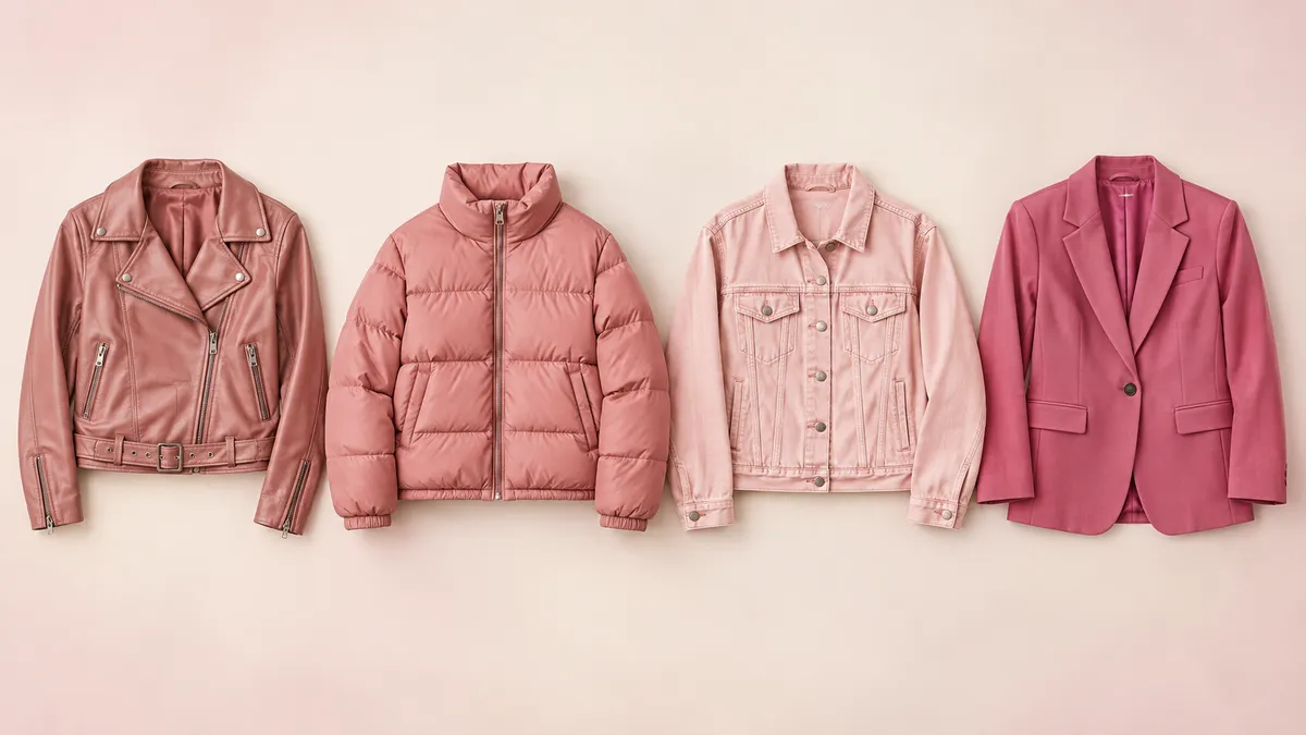
Find Your Pink Jacket
Weather, fabric, fit and shade: make the choice that fits your week.
Read the guide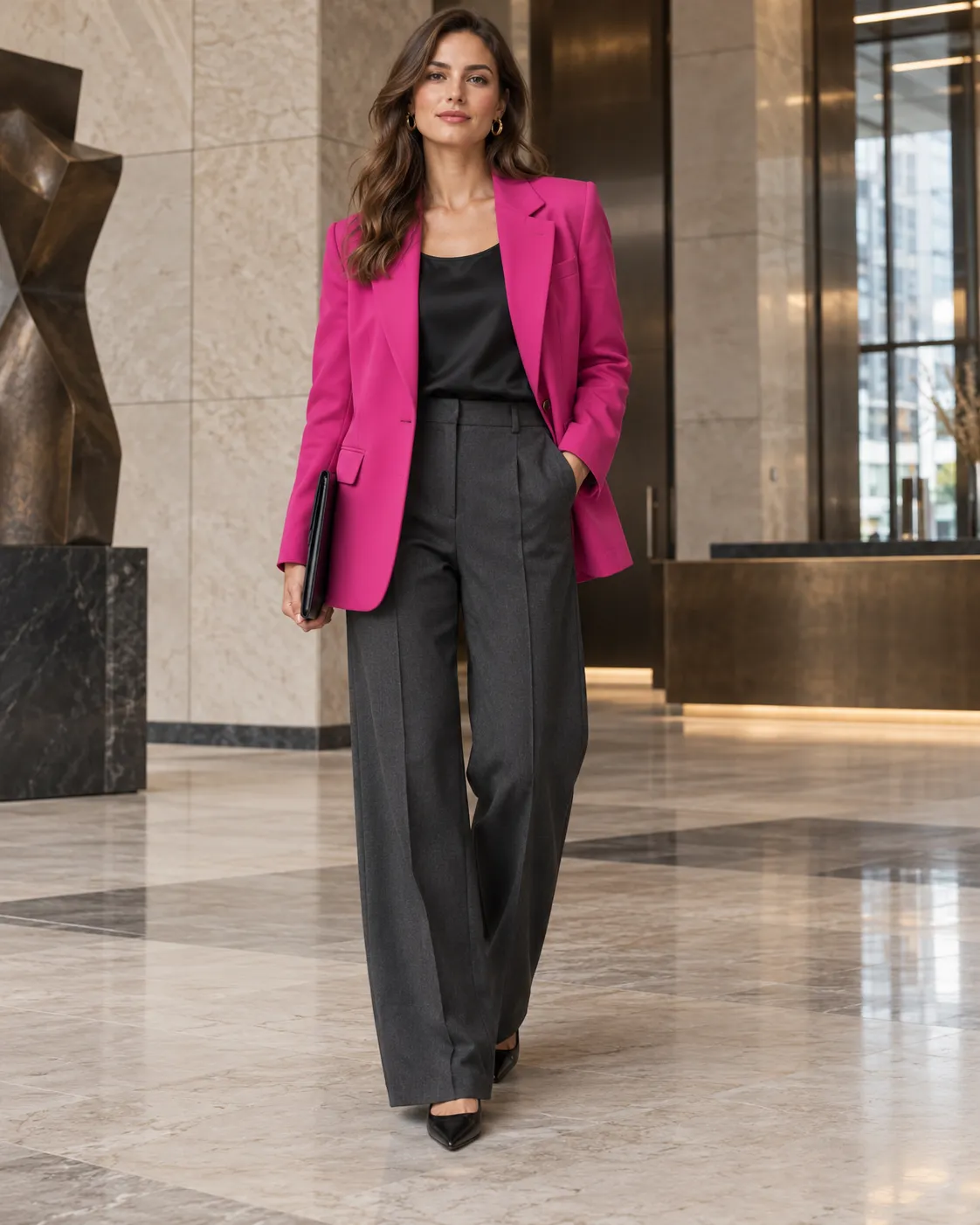
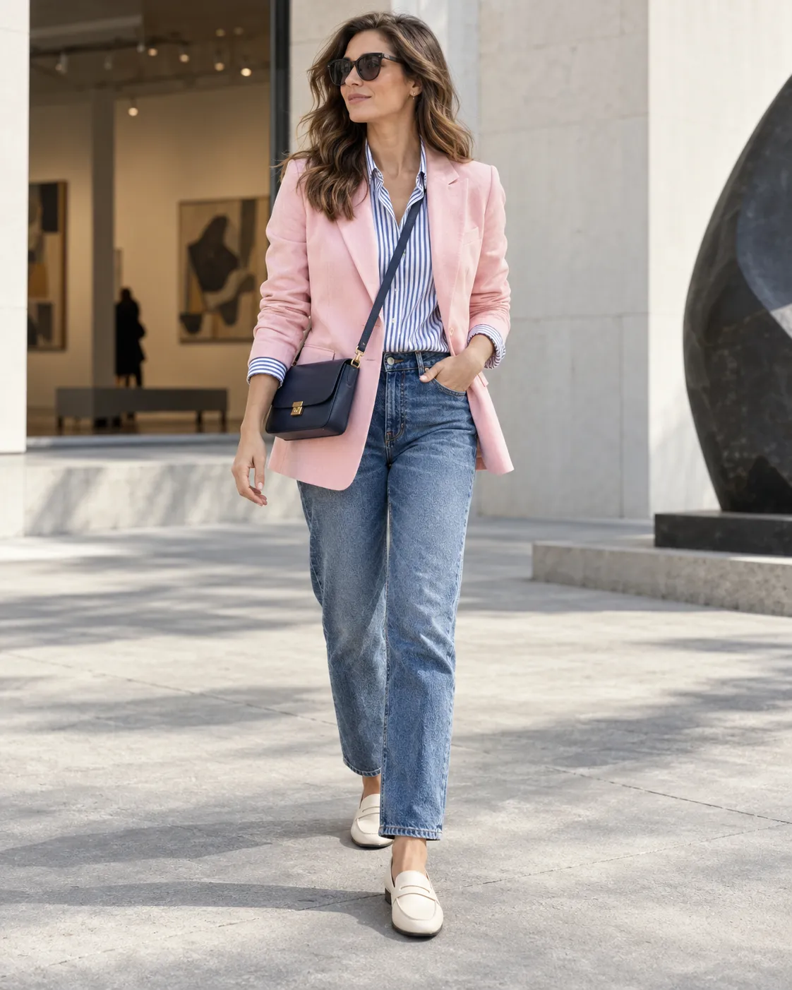
10 Pink Jacket Outfits
From a coffee-run moto to a winter travel look, ten complete ways to wear pink.
Read the guide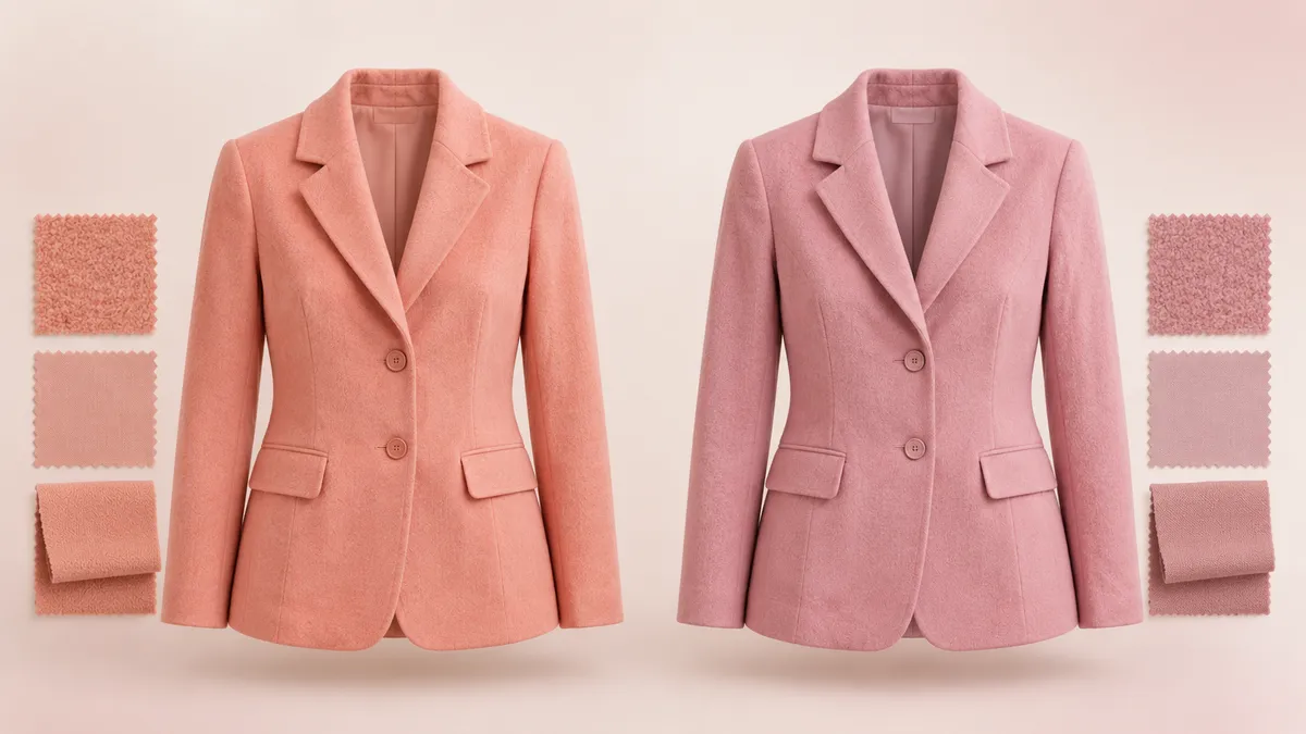
Warm Pink or Cool Pink?
See how coral, rose and raspberry change with fabric and the colors around them.
Read the guide